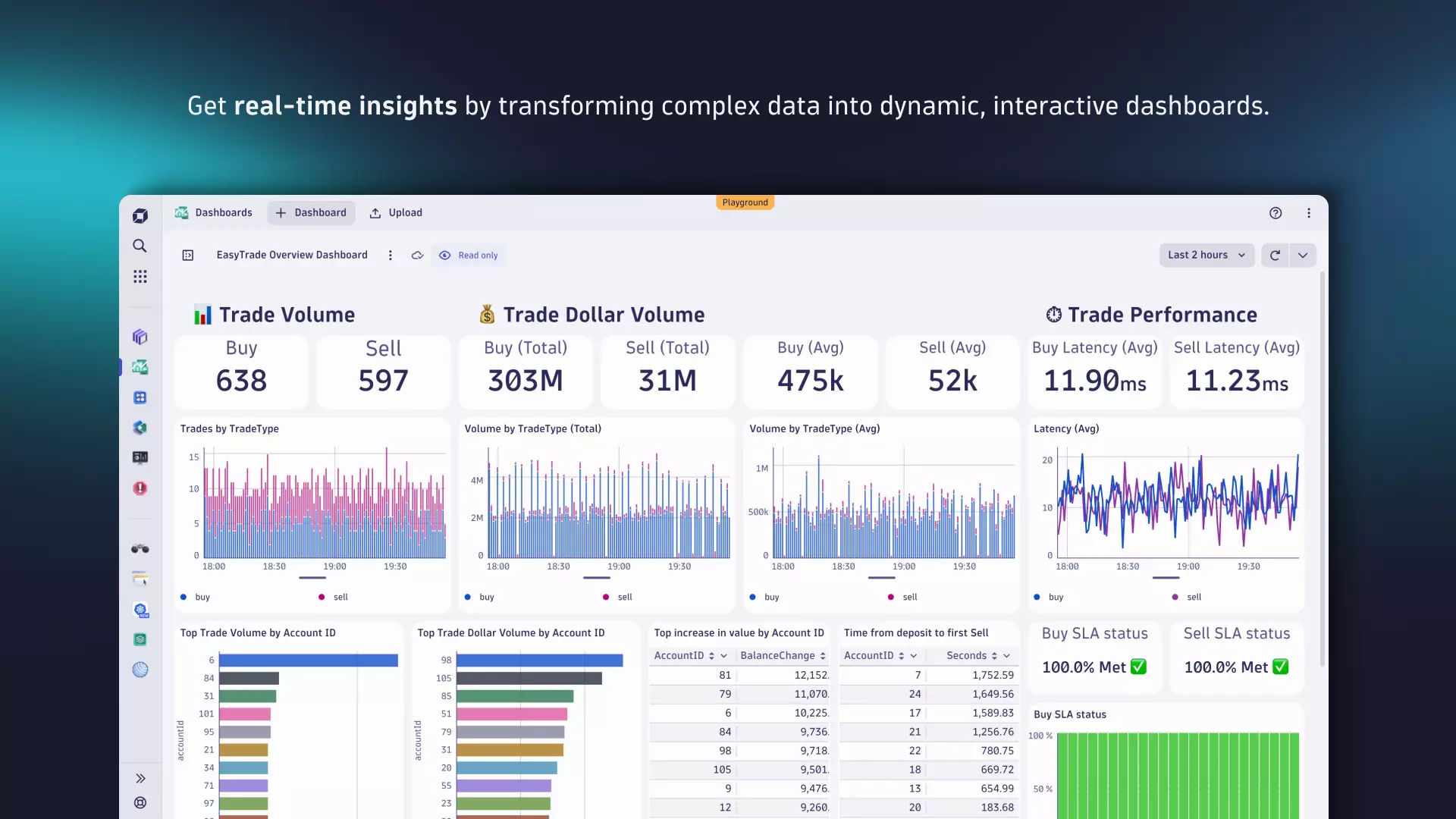
When we launched the new Dynatrace experience, we introduced major updates to the platform, including Grail™, our innovative data lakehouse unifying observability, security, and business data, and Dynatrace Query Language (DQL) for accessing and exploring unified data. While Grail and DQL opened up nearly limitless possibilities for data exploration, mastering DQL was necessary to fully leverage the power of Grail. Our latest enhancements to the Dynatrace Dashboards and Notebooks apps make learning DQL optional in your day-to-day work, speeding up your troubleshooting and optimization tasks.
In this blog post, we look at these enhancements, exploring methods for monitoring your Kubernetes environment and showcasing how modern dashboards can transform your data. Furthermore, we illustrate how these methods work seamlessly with Dashboards and Notebooks to enhance their effectiveness.

The many paths to building a dashboard or notebook
Getting started with the new Dashboards is now easier than ever, offering unprecedented ease and capabilities for exploring your data. We’ve not only improved how you interact with data in dashboards and notebooks, we also enhanced the way that underlying data can be shared across apps. These updates expand your options for exploration and creation, helping you to build your dashboards and notebooks quicker and more intuitively.
You can now:
- Kickstart your creation journey using ready-made dashboards
- Accelerate your data exploration with seamless integration between apps
- Start from scratch with the new Explore interface
- Search for known metrics from anywhere
Let’s look at each of these paths through an end-to-end use case focused on Kubernetes monitoring.
Kickstart your creation journey using ready-made dashboards and notebooks
Creating dashboards and notebooks from scratch can take time, particularly when figuring out available data and how to best use it. Ready-made dashboards and notebooks address this concern by offering pre-configured data visualizations and filters designed for common scenarios like troubleshooting and optimization.
These ready-made dashboards offer your platform engineers, who oversee Kubernetes environments, immediate and comprehensive data visibility. This allows platform engineers to focus on high-value tasks like resolving issues and optimizing performance rather than spending time on data discovery and exploration.
Kickstarting the dashboard creation process is, however, just one advantage of ready-made dashboards. Let’s assume you’re already using the new Kubernetes app, which offers a comprehensive overview of your Kubernetes environments and their telemetry. There are cases where more flexible data presentation is needed. Our new ready-made dashboards for Kubernetes not only provide instant insights into your clusters, nodes, workloads, or pods but also enable you to extend and customize the data shown in the Kubernetes app, leveraging the context-rich data from Dynatrace Grail. So, for example, if you need to seamlessly integrate metrics with logs for your workloads, you can create a customized view based on the pre-configured dashboard that consolidates all critical signals in one place, which is particularly essential for troubleshooting.
Finding ready-made dashboards is straightforward. Navigate to the list of dashboards and set the filter at the top right to Ready-made. Select the title of any dashboard that interests you, or use the search bar to narrow down the results.

Accelerate data exploration with seamless integration between apps
In developing the new Dynatrace experience, our goal was to integrate apps seamlessly by sharing the context when navigating between them (known as “intent”), much like sharing a photo from your smartphone to social media. This approach acknowledges that in any organization, software doesn’t work in isolation; boundaries and responsibilities are often blurred. This is even more true for critical scenarios like troubleshooting, which often requires more than the capabilities of a single person or app.
Let’s make this more tangible by using the Kubernetes cluster dashboard and demonstrating how this concept helps you to:
- Seamlessly navigate between apps while maintaining context.
- Effortlessly explore data in Dynatrace and create dashboards from it.
When working with the Kubernetes cluster dashboard, you have two options for digging deeper into further analysis, both using the Kubernetes app. You can use dynamic markdown links, which include the values of the actual dashboard variables, or you can utilize the open-with feature (the “intent” concept), which uses the actual context of the dashboard tile you’re viewing. With this latter approach, you even have the choice of passing a single value (Open field with) or all underlying data (Open record with) for the respective element (row, series, cells, etc.) when navigating to another app.

Next, let’s use the Kubernetes app to investigate more metrics. The intent concept and the open with feature can also be applied in reverse to include data or specific visualizations from an app on a particular dashboard. An example of this is shown in the video above, where we incorporated network-related metrics into the Kubernetes cluster dashboard.
Start from scratch with the new Explore interface for metrics in Dashboards and Notebooks
Once you’ve learned how to monitor your Kubernetes cluster using a ready-made dashboard and extending it with context from other apps, the next step is understanding how to create and extend such dashboards using the Dashboards or Notebooks app.
Exploring and adding metrics from scratch
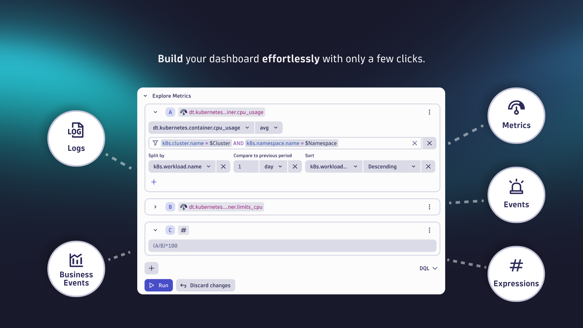
Let’s revisit our example from the last chapter and add the same Kubernetes network metrics, this time by using the new Explore metric interface that allows you to:
- Browse and add multiple metrics to a single tile
- Apply basic commands such as aggregation, filter, and split
- Use expressions to do calculations based on previously added metrics

The revised Explore interface, as shown in the clip above, now includes logs, metrics, events and business events, offering an improved filtering experience that enables you to:
- Type ahead to add, edit, or remove available filters
- Control how filters are applied via a rich set of operators (=, !=, in, not in, >=, <=, >, <)
- Place wildcards before and after your filter values to automatically generate the best matching DQL when using startsWith, endsWith, or contains.
- Control how filters are combined with logical operators, such as AND or OR
- Easily filter entities by ID, name, or tags in the web UI
- Get suggestions for metric values and entities (IDs, names, tags) for all data types

Blend metrics with data from Explore logs for a more comprehensive view to start log analysis
With the enhanced Explore Logs interface, retrieving and viewing logs from your Kubernetes workloads is straightforward. By incorporating a new tile, you can integrate these logs into your dashboard along with key metrics, such as the new Kubernetes network metrics we added earlier.
Leverage dashboards to monitor your environment in real time through log data. Once you identify an anomaly that requires your attention, you can start troubleshooting by delving further into the issue using the Open with option and the intent mechanism in the new Logs app. This app provides advanced analytics, such as highlighting related surrounding traces and pinpointing the root cause, as illustrated in the example below.

Leveraging the capabilities of Grail and Smartscape® topology, Dynatrace seamlessly integrates logs, metrics, and traces to offer enhanced context for troubleshooting and in-depth analysis. This integration facilitates a comprehensive understanding of individual transactions through the Distributed Traces app and aids in pinpointing the root cause of issues when using the Problems app.
Intuitive data access with Davis CoPilot™ AI assistant
There’s also a brand new and completely different option for analyzing data using natural language; using the power of generative AI, Davis CoPilot converts your conversational prompts into accurate DQL commands, allowing both non-technical users as well as experienced data analysts to make data-driven decisions faster than ever before.

To learn more about how Davis CoPilot empowers you and your teams, see our blog post, Announcing General Availability of Davis CoPilot: Your new AI assistant.
Search metrics from anywhere
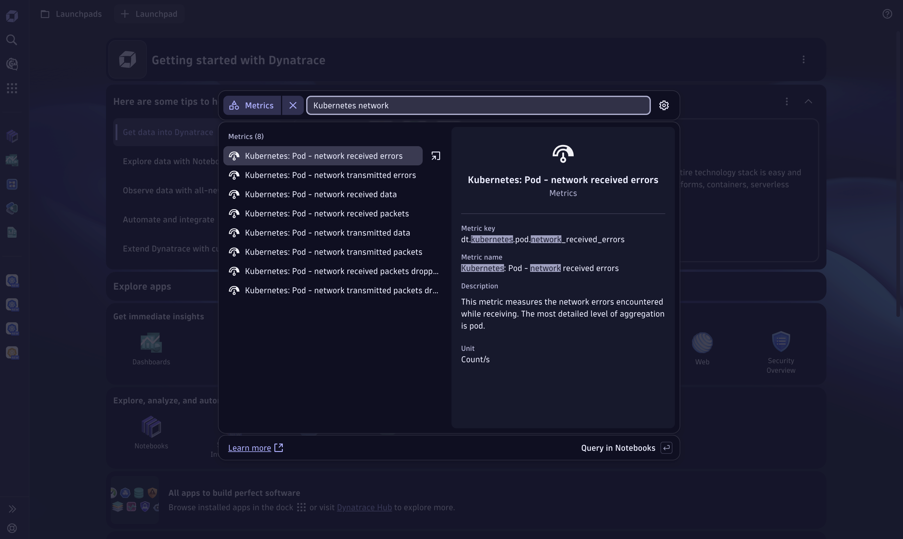
A speedy way to begin your data exploration journey, particularly if you already know which data you need, is to utilize our global search feature to effortlessly find and explore metrics from anywhere on the Dynatrace platform. This feature lets you explore any available metric and add it to Notebooks or Dashboards.
Imagine a colleague mentioning a newly released metric for Kubernetes during a coffee break. Rather than manually exploring the Kubernetes app you can simply open the Dynatrace global search and enter “Kubernetes network.” The relevant metrics are then immediately displayed alongside further details.
This efficient method allows you to easily browse and identify the appropriate metrics; adding them to your notebooks and dashboards requires just a single click.

Get started discovering and exploring your data
It has never been easier to analyze data within Dynatrace. Kickstart your data exploration journey and familiarize yourself with ready-made dashboards and the new Explore data interface. By the way, we also added new data visualization capabilities by adding new chart types and chart interactions.
Curious about our latest releases and upcoming features for Dashboards and Notebooks? Check out our community roadmap thread to stay updated!
Are you ready to try out the new Explore Data features?
 4 months ago
36