 1 week ago
9
1 week ago
9
Creating dashboards with advanced intelligence and analytics platforms can be intimidating for inexperienced users. At Dynatrace, we've completely redesigned our dashboard creation process to make it easy for everyone to achieve quick results. In this blog post series, you'll learn how to achieve amazing results by creating interactive, AI-powered dashboards with no pre-existing knowledge, starting from scratch.
Welcome, data enthusiasts! Whether you’re a seasoned IT expert or a marketing professional looking to improve business performance, understanding the data available to you is essential.
That’s where Dynatrace dashboards come in. They aren’t just fancy visuals; they’re your go-to tool for making sense of your data, understanding correlations, and gaining real-time insights.
With Dashboards, you can monitor business performance, user interactions, security vulnerabilities, IT infrastructure health, and so much more, all in real time. You can even drill down to discover the root causes of issues—all from a single view. Dynatrace offers ready-made dashboards for many use cases that you can immediately start using. For all other use cases, you’ll find that creating custom dashboards and gaining valuable insights is quick and easy, and dashboards are incredibly versatile in meeting your specific requirements.
In this blog series, we’ll guide you through creating powerful dashboards that transform complex data into actionable insights.
Starting from scratch, we’re going to show you how to
- Create charts with just a few clicks
- Enhance your dashboard with AI
- Make your data look beautiful
- Approach and execute complex queries
- Use readymade dashboards as a fast route for deep insights
- Interact with your dashboards to speed up problem resolution
- Boost user experience by applying design best practices
- Make the most out of variables and advanced filtering
Learn how to create charts with just a few clicks
In this first installment, we’ll guide you through creating the simple dashboard shown below using the Explore functionality. In our next blog post, we’ll further enhance this dashboard with AI and increase its visual appeal and usability.
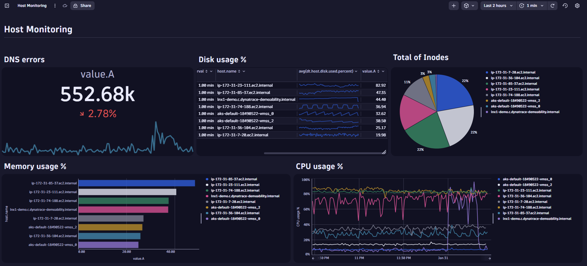 Figure 1. Follow along to create this host monitoring dashboard
We will create a basic Host Monitoring dashboard in just a few minutes. Even if infrastructure metrics aren’t your thing, you’re welcome to join us on this creative journey – simply swap out the suggested metrics for ones that interest you. By following along, you will learn how to create custom dashboards and get to know different chart types.
Host Monitoring dashboards offer real-time visibility into the health and performance of servers and network infrastructure, enabling proactive issue detection and resolution. Good dashboards cover a broad range of metrics, and Dynatrace already provides an expertly developed, ready-made infrastructure dashboard that covers most use cases. However, creating a custom dashboard can be incredibly useful if you want to gain insights into specific hosts or issues.
For our example dashboard, we’ll only focus on some selected key infrastructure metrics. Let’s begin by creating your dashboard.
Create a dashboard from scratch and familiarize yourself with tiles
If you’re an existing Dynatrace customer, simply navigate to Dashboards. First-time users can follow along on the Dynatrace Playground.
Create a new dashboard
In the Dashboards app, select + Dashboard. You can update the name of your still empty dashboard by clicking on untitled dashboard to Host Monitoring.
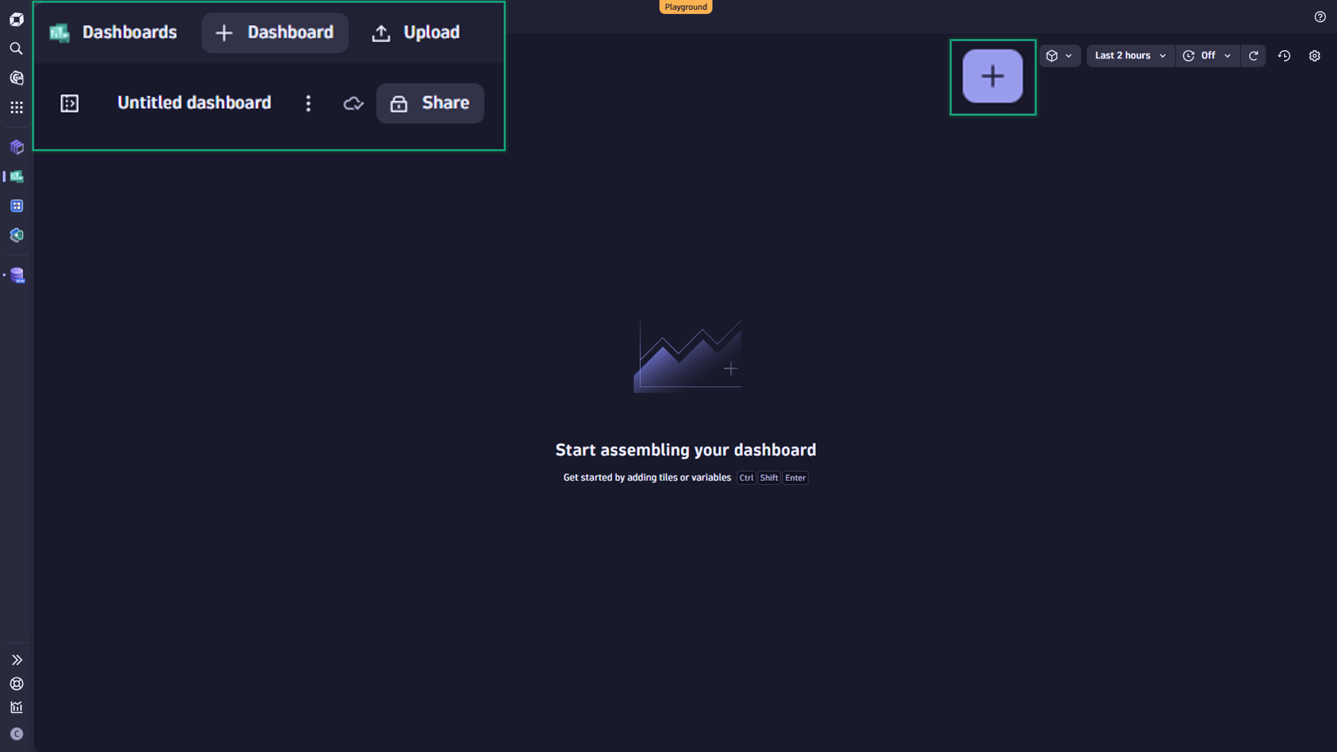 Figure 2. Create a new dashboard. Change its name and add your first tile.
Add tiles
In Dynatrace, visualizations and other elements on your dashboard are called tiles. Here you can find more information on the different types of tiles.
Let’s start our exploration journey by adding our first Metrics tile: DNS errors.
DNS errors detail the number of failed DNS queries and serve as a valuable KPI for host monitoring. This information is crucial for identifying network issues, troubleshooting connectivity problems, and ensuring reliable domain name resolution.
For near real-time analysis, we’ll focus on DNS errors within the last two hours and visualize the number of errors within this timeframe as a single-value visualization.
Additionally, we’ll include a trend indicator to show changes in the quantity of DNS errors compared to the previous data point and add a sparkline to visualize DNS errors over time.

Figure 3: Add dns_errors to your dashboard and show it as a single value chart
Creating a single-value chart showing DNS errors
- Select + in the upper right corner to show the list of available tiles.
- A new tile will appear on your dashboard.
- A panel with the tile options appears on the right side. To find the metric, go to the “Explore” section on the data tab.
- Click on Select metric. Select the category Infrastructure and then DNS.
- Select Number of DNS errors by type.
- Now you can choose a calculation for your metric. Next to your selected metric, you see avg as default selection. Change it now to sum.
- Below, you see the Split by We don’t need this one for now, so we can remove it by selecting x. Instead, click on the + button right below and select Reduce to single value. Update the calculation to Sum.
- Finally, select RUN.
- Now, all that is left is to update the visualization. Go to the Visual tab and change the visualization type to Single Value.
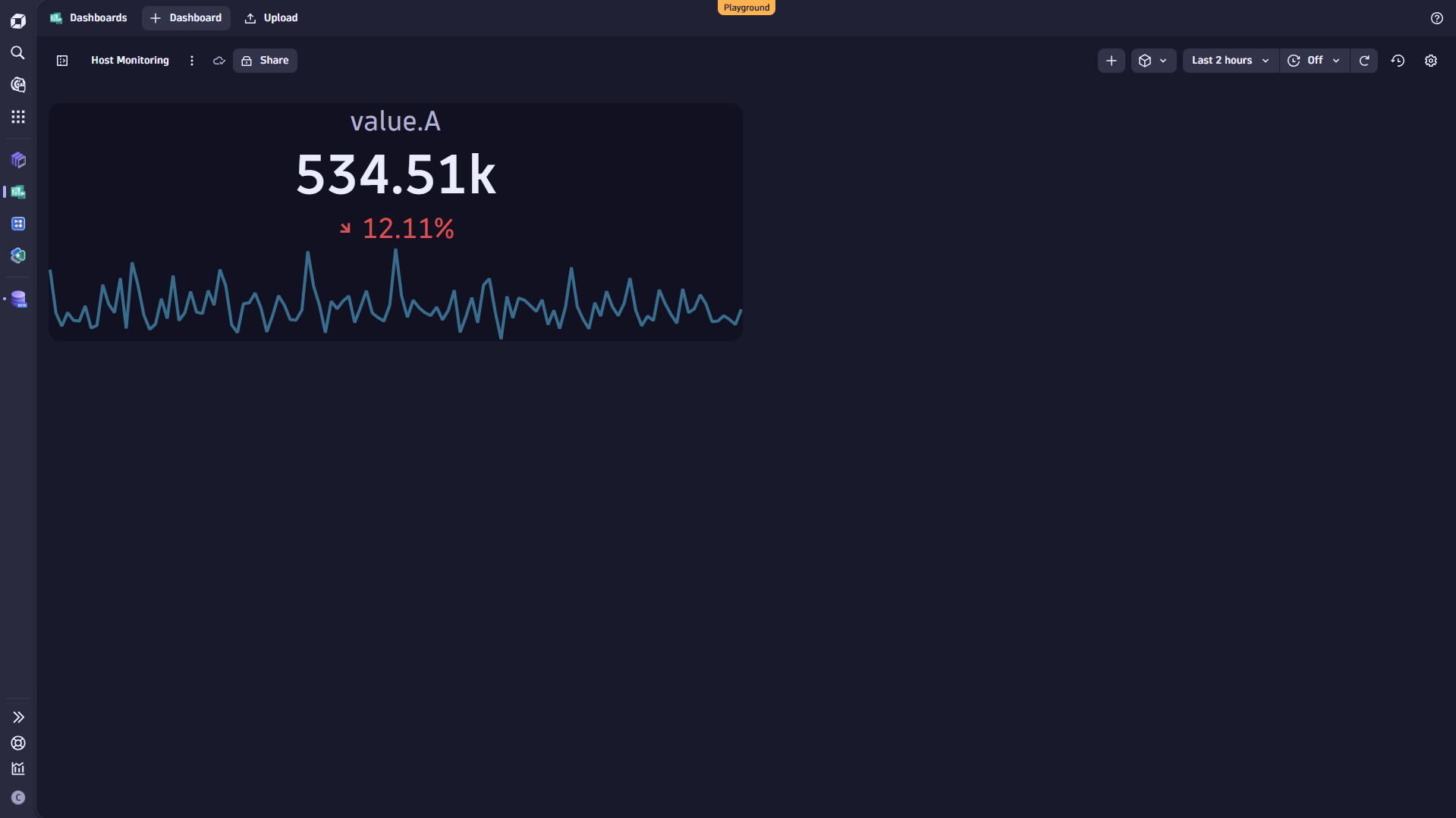 Figure 4. You have successfully added your first chart to your dashboard.
Congratulations. You’ve created your first visualization on your dashboard. As you went through these steps, you likely noticed some of the chart options available. Not only can you select a metric, but you can also add multiple filters, use sorting, or directly apply calculations like average or sum. For more information, you can always check our documentation.
Next, we want to gain visibility into disk usage, particularly the disk space used for each host. We’ll split the data by host, calculate the average percentage, and add a time series to understand the behavior over time.
The best way to visualize all this information in a single chart is a table.
Creating a table on disk usage
- Create another Metrics
- This time use the Search function to find the Disk used % Alternatively, select it from the category Infrastructure/Disk.
- Leave avg as default for the calculation.
- Leave Split by and select to split by name.
- Click on + (the one which is directly placed over the RUN button) and add Sort.
- To sort the filtered data, select `avg(dt.host.disk.used.percent)` from the list. By default, sorting will be
- Select Run.
- Go to the Visual tab and change the visualization type to Table.
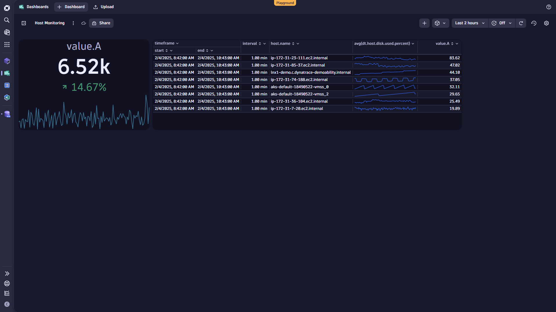 Figure 5. Visualize disk used percent as a table chart.
Great job! I believe you’re getting the hang of it.
We’re now adding Inodes Total as a pie chart to our dashboard. Monitoring the total number of inodes helps ensure the filesystem remains healthy and prevents errors caused by running out of inodes. It also provides insights into system performance and allows for proactive management.
Creating a pie chart showing Inodes
- Create a new Metrics
- Add the Inodes Total metric from the category Infrastructure/Disk.
- Leave avg as default for the calculation.
- Leave Split by and select to split by name.
- Add Sort.
- Select`avg(dt.host.disk.inodes_total)` and sort
- Select Run.
- Go to the Visual tab and change the visualization type to Pie.
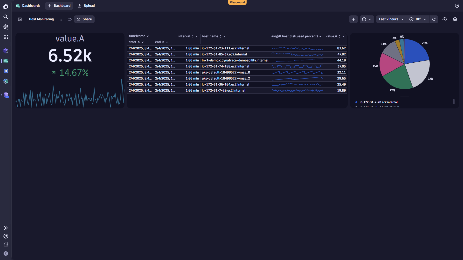 Figure 6. Add Total of Inodes as a pie chart.
You’re making fantastic progress with your dashboard!
We want to determine the average memory usage for each host and condense the results into a single value. Monitoring average memory usage per host helps optimize performance and manage resources efficiently. It also aids in troubleshooting and controlling costs by identifying memory inefficiencies.
Creating a single-value chart showing memory usage
- Create a new Metrics
- Select Memory used % from the category Infrastructure/Memory.
- Leave avg as default for the calculation.
- Leave Split by and select to split by name.
- Add Sort.
- Select `avg(dt.host.memory.usage)` and sort
- Select Run.
- Go to the Visual tab and update the visualization to Categorical.
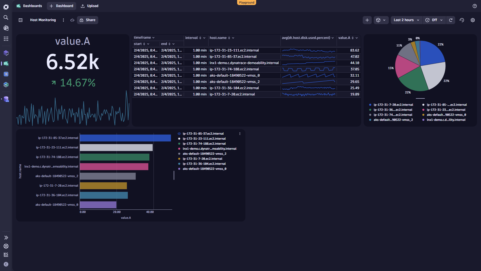 Figure 7. Add Average memory usage as a categorical chart.
Finally, we also want to add CPU usage to our dashboard. Monitoring CPU usage helps ensure optimal performance, enabling you to manage your resources and ensure smooth system operations proactively.
Creating a timeseries chart on CPU usage
- Create a new Metrics tile.
- Select CPU usage % from Infrastructure/Disk.
- Leave avg as default for the calculation.
- Leave Split by and select to split by name.
- Select Run.
- The recommended, default visualization should be a Line chart. (if not, go to the Visual tab and updated the visualization to Line chart).
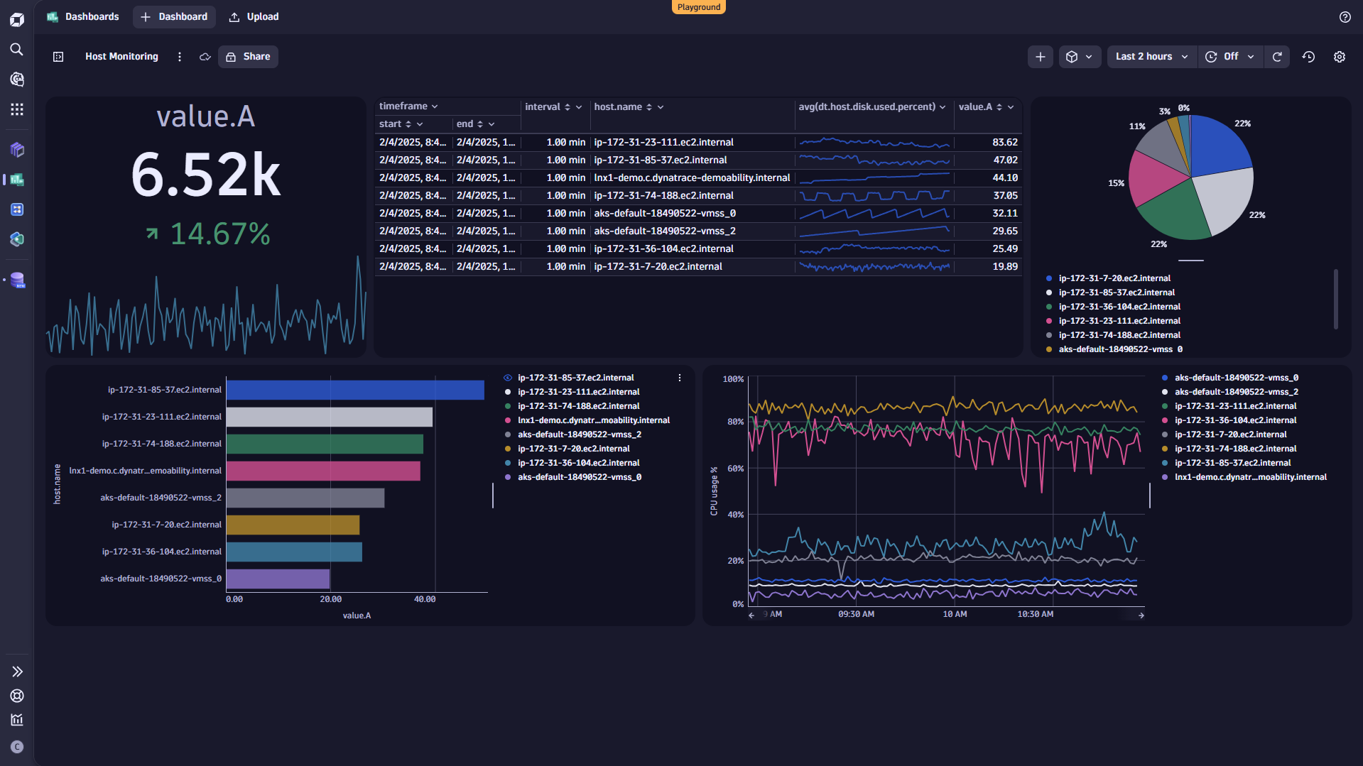 Figure 8. Add CPU usage % as a line chart.
Isn’t it marvelous? You have created your first dashboard in just a few minutes. In the final step for now, we will just add some simple structure to your dashboard.
Arrange your charts and add some structure
We want our dashboard to be well-structured to make it easier for users to find relevant information. First, we can easily adapt the size of our charts and move them around on our dashboard:
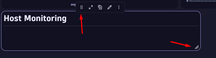 Figure 9. Adjust the size or rearrange the position
Titles and additional information are also good ways to add more structure. For that, we use markdown tiles. Markdown tiles enable adding text, images, links, or key points.
Add titles to your dashboard
- Create a Markdown
- In the options menu we can now provide the text we want to show. For a title, we select H1 and write Host Monitoring as a title text after the #:
- Then, we add a break and write “—” to add a line below the headline.
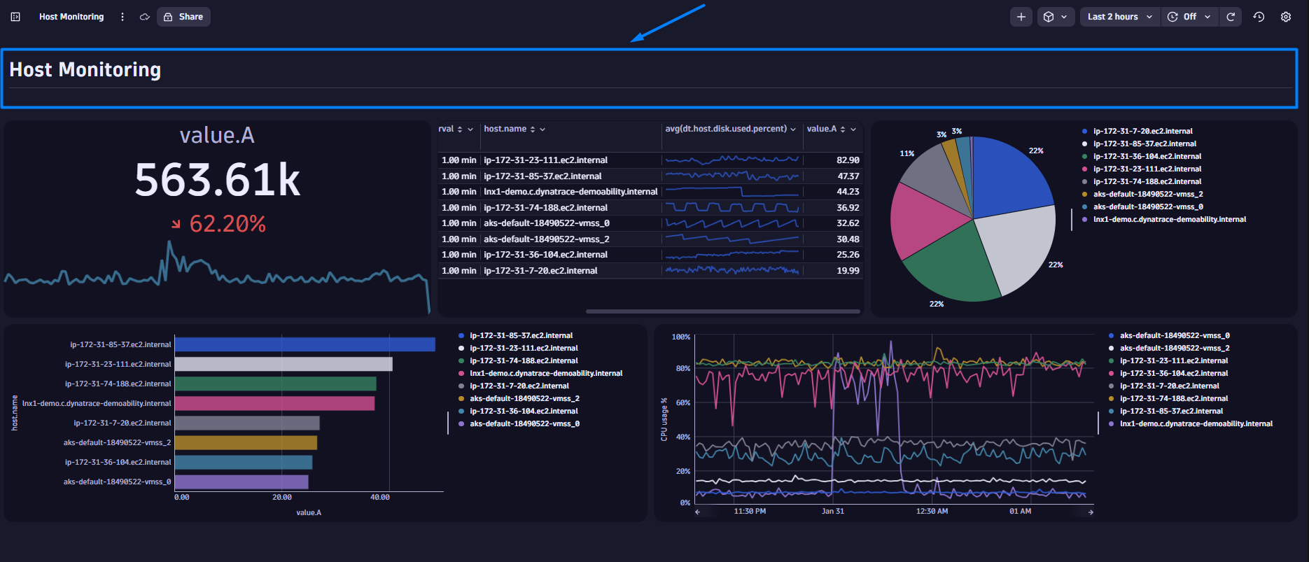 Figure 10. Add a section title
You can now add additional subtitles or provide written guidance to new users on how to use and understand the dashboard.
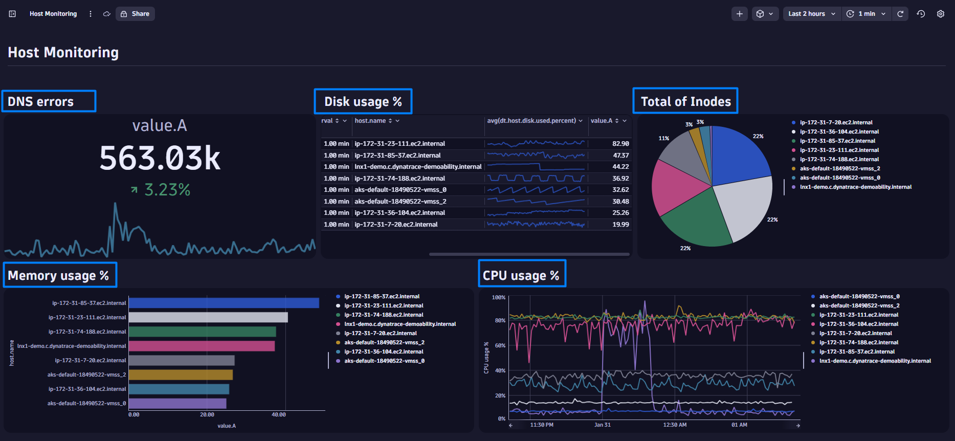 Figure 11. Add structure to your dashboard to make it easier to use.
Where to go from here
You’ve now learned the basics of dashboard creation. Stay tuned for Part 2 of this series, where we’ll explore how to harness AI to elevate your dashboard to the next level. We will also introduce you to various options to make your dashboard even more visually stunning.
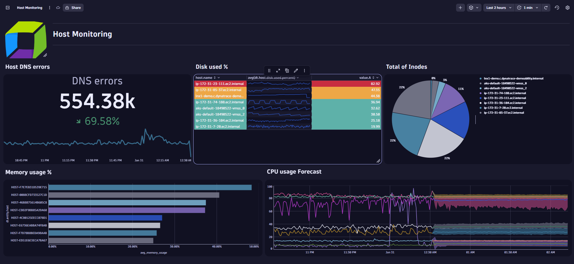 Figure 12. In our next blog post we will enhance our dashboard with AI and apply conditional formatting.
In the meantime, if you’re eager to deepen your knowledge of Dynatrace dashboards, we recommend exploring the following resources:
- Play around with different types of tiles: Familiarize yourself with the various tile options.
- Interact with your dashboards: Utilize the Open with function to delve into use case-specific Dynatrace Apps. Additionally, use panning and zooming features to gather more detailed information directly on your charts.
- Learn from experts: Duplicate ready-made dashboards to tailor them to your needs. Examine the underlying configurations to gain insights into creating complex dashboards. Also, explore additional dashboards available on the Dynatrace Playground.